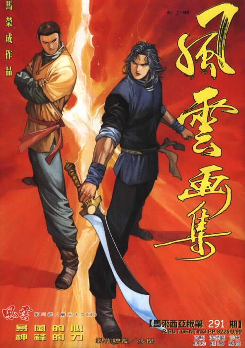
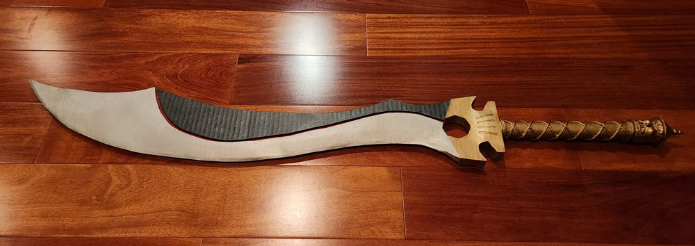
In Chinese martial arts, the two most beloved types of weapons are the curved saber (刀 dao) and the straight sword (劍 jian). Pitching the two as complementary or in rivalry is a trope deeply ingrained in the fictions of our culture. From a little boy playing with plastic toys that my mom bought from the market, to a young adult reading wuxia classics late into the night, I had always preferred the single-bladed sabers and the characters associated with them.
When I began on my cardboard blacksmithing journey earlier this year, I really wanted a curved saber in my arsenal. However, with all cardboard being rectangular and my tools working only in straight lines, I didn’t think making a curved model was possible. Choosing Can Jian as my starting point was in part because it had a simple shape. By the time I finished Hegemon’s Spear, though, I had developed techniques that could greatly expand the scope of my work. My hands itched, and my eyes were set on making a replica of 驚寂 Jing Ji.
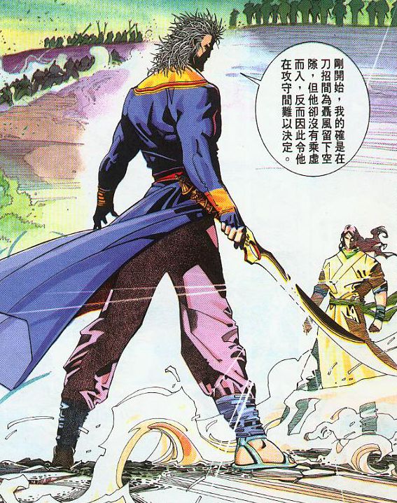
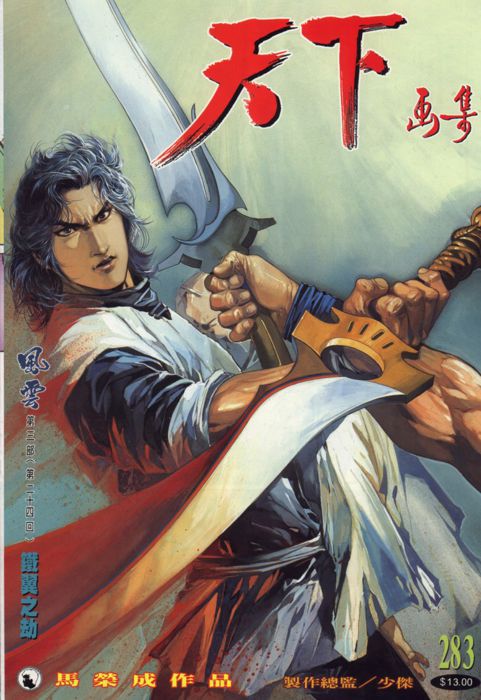
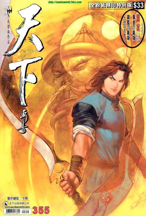
Jing Ji came from Wind Cloud (風雲 Fung Wan aka Tin Ha and adapted as the Storm Riders), the most well known and successful Hong Kong manhua series. In this universe, the best weapons are sentient. Repeatedly introduced as “the number one saber from Japan”, Jing Ji is extremely prideful and would wound any unqualified person trying to hold it. Thus it remained in a sword-in-the-stone dormant state for 100 years, until being tamed one day by this manly man of a martial arts fanatic.
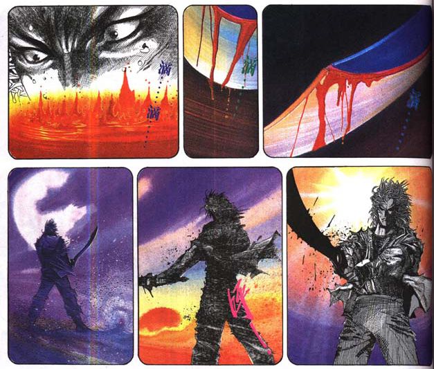
Unlike some of its peers, Jing Ji does not stand for good or evil. It singularly represents an obsession for battle. In the real world we’d call it toxic masculinity; but for fans of the wuxia universe, the pursuit of martial arts purity is a highly regarded virtue.
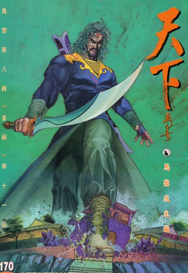
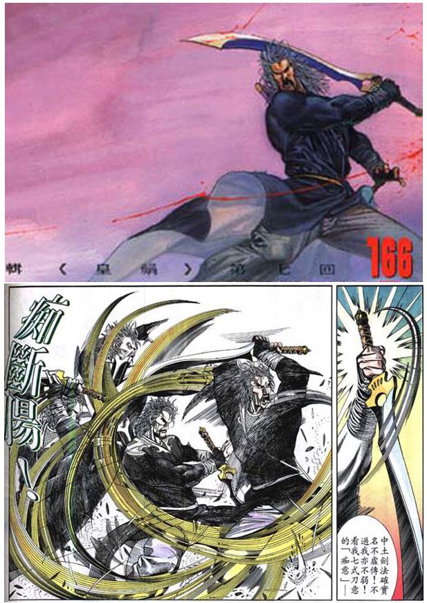
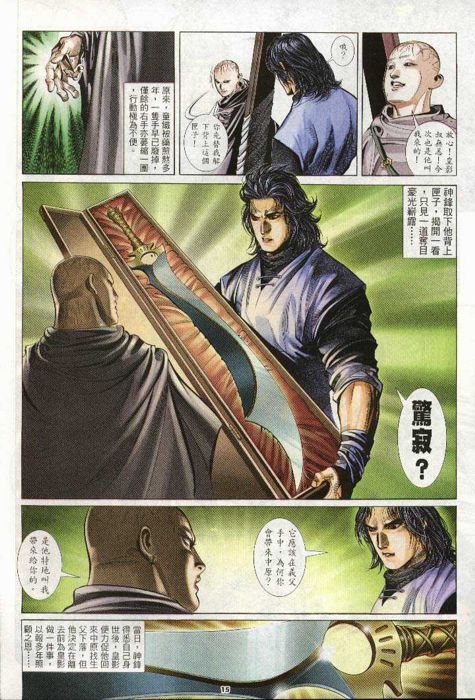
In volume 3 of Wind Cloud, Jing Ji got passed down to the manly man’s godson, who became the primary protagonist of the new story line. Those years brought some of the most detailed drawings of this saber, which were very helpful references for my project.
1. The Planning
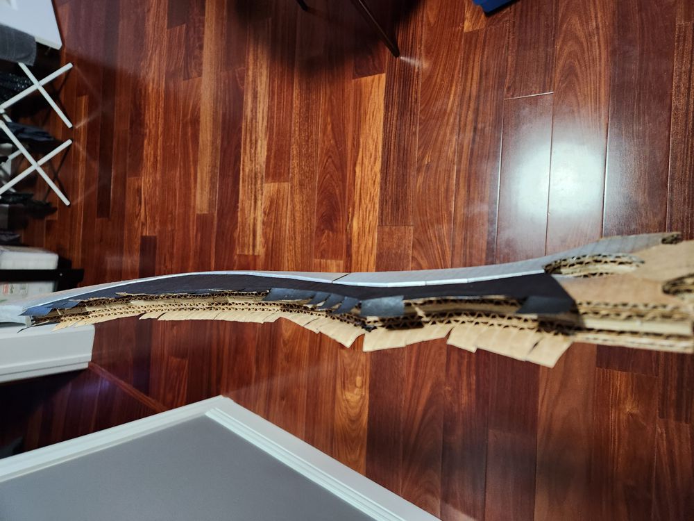
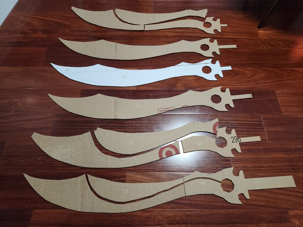
I was confident about this project because it required exactly the same techniques that I recently used in the spear head: approximating curves in the horizontal plane with short straight lines (a calculus concept!), and creating 3D shapes in the width dimension using successive layers. However:
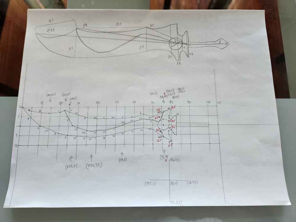
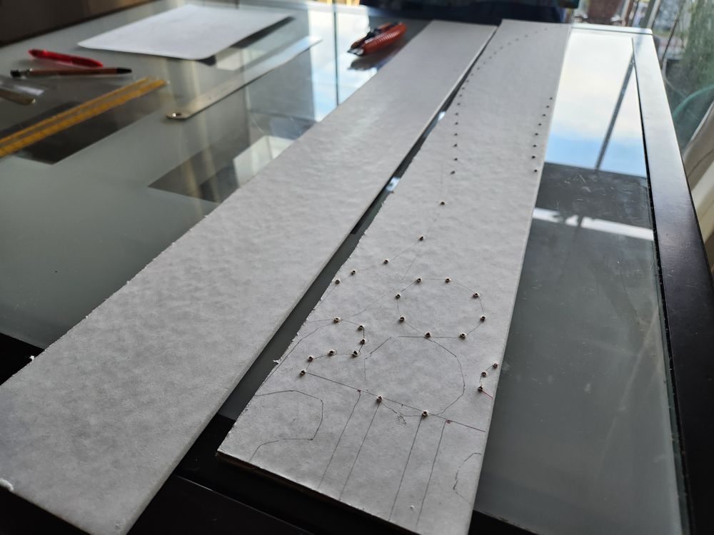
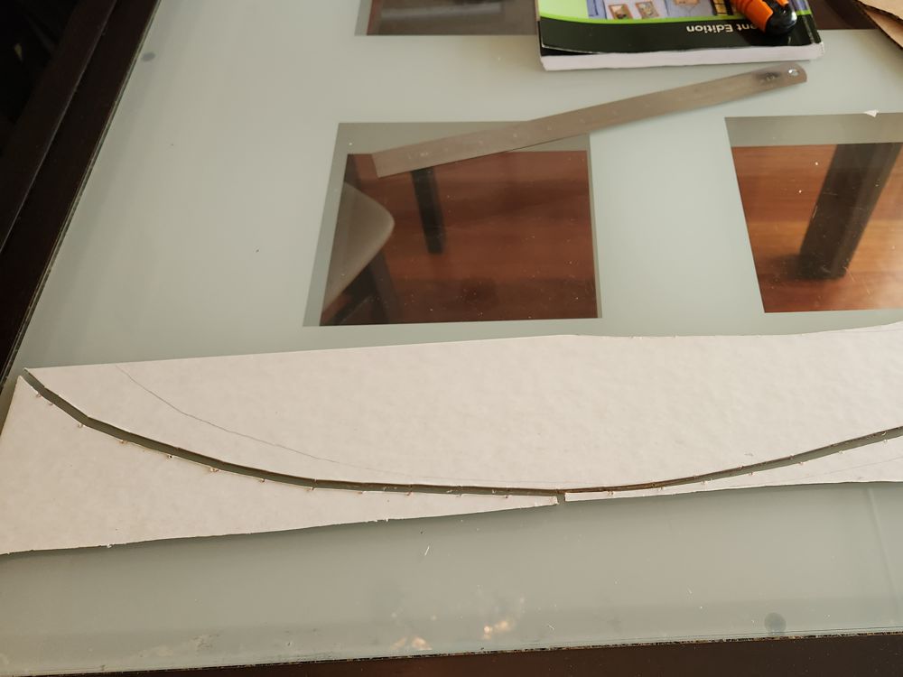
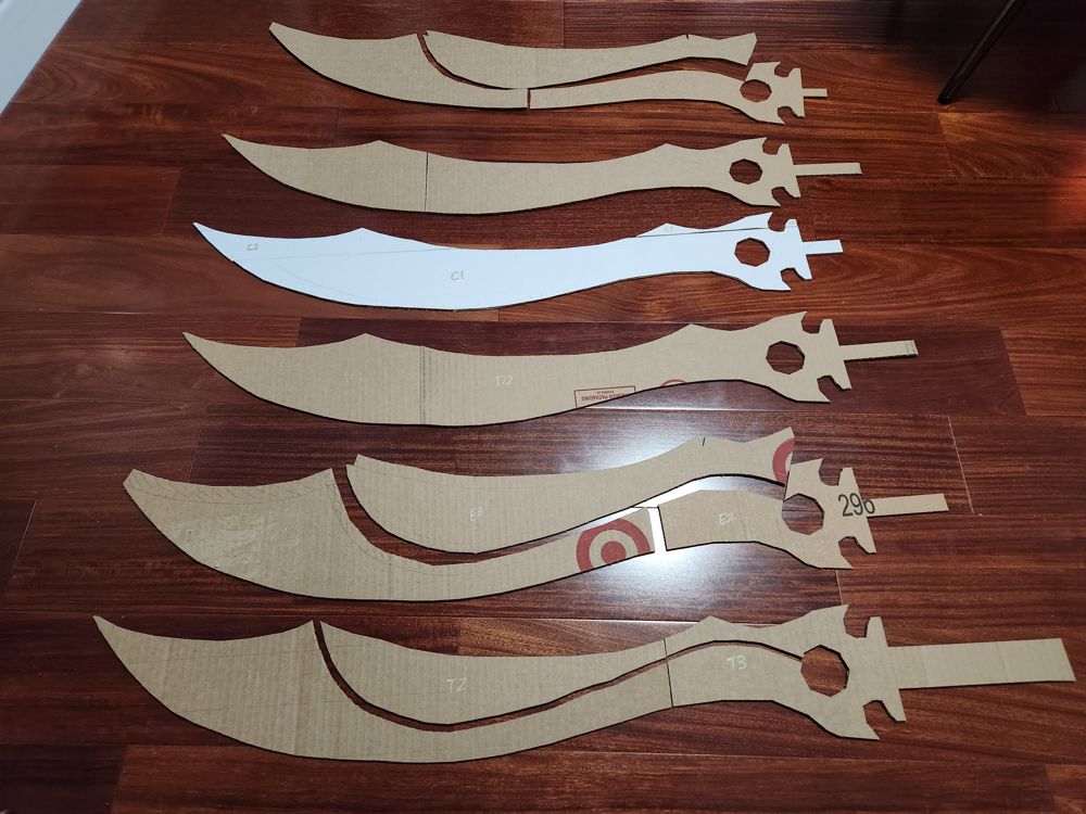
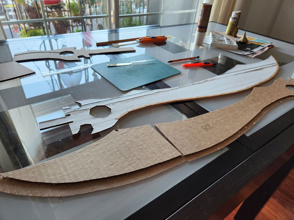
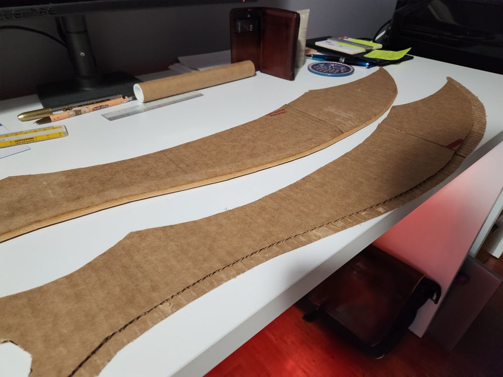
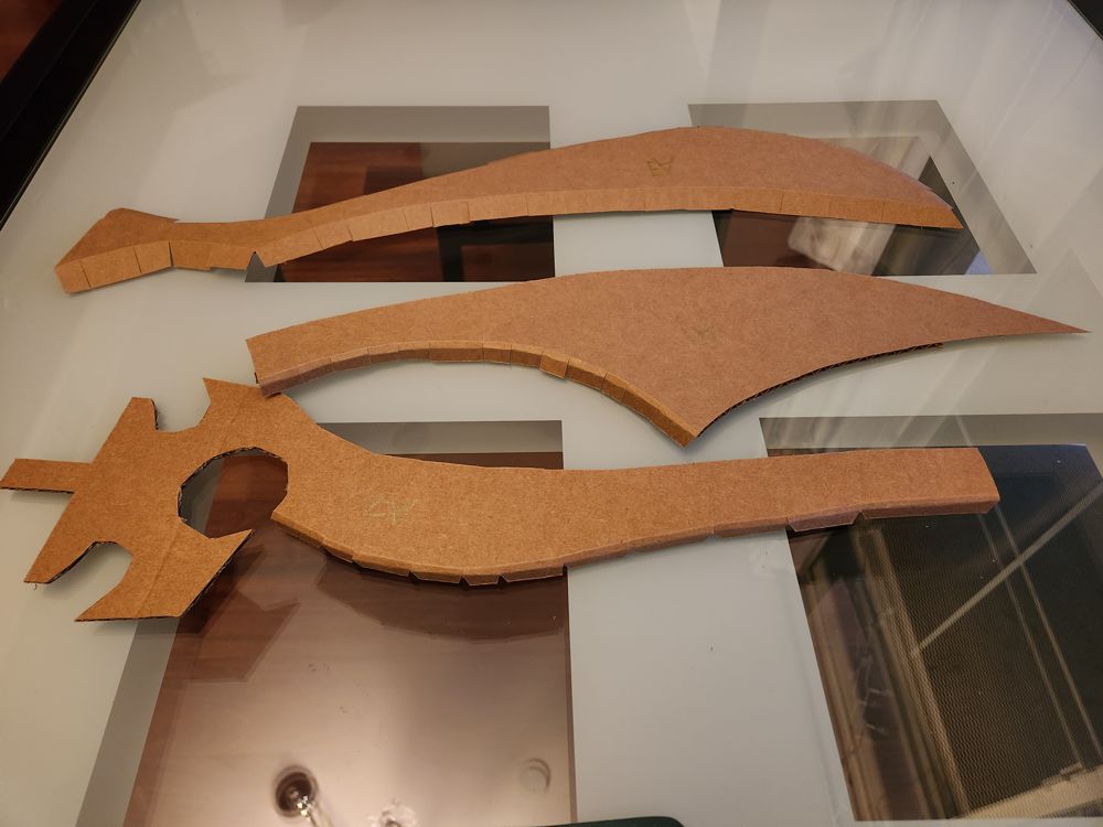
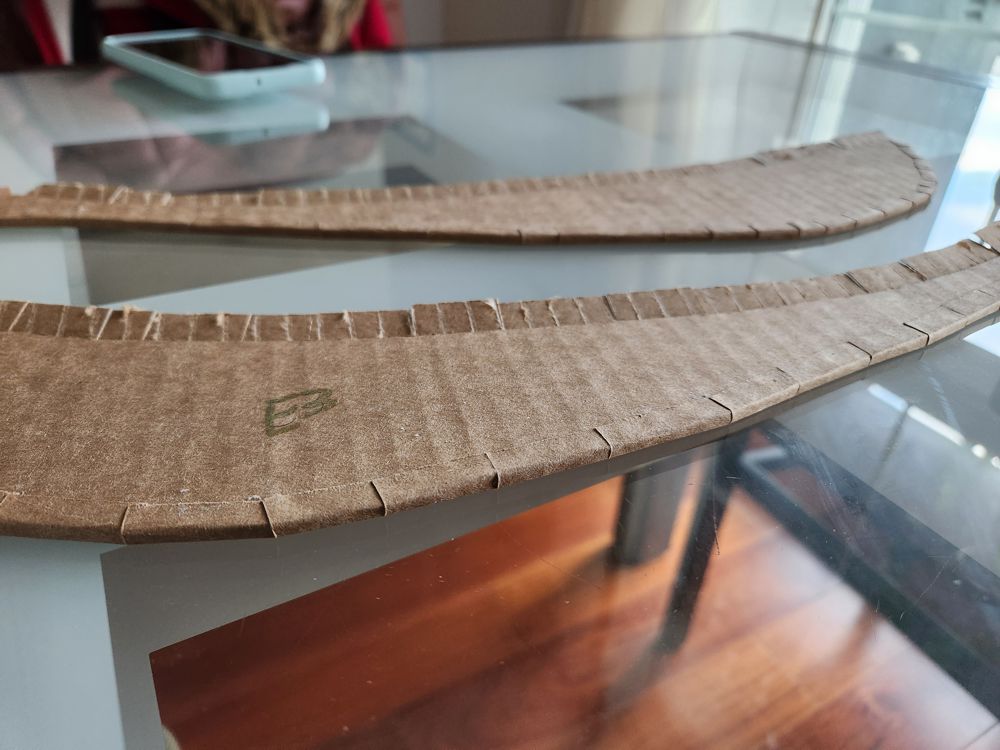
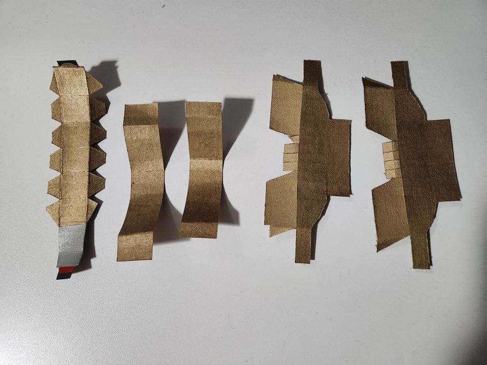
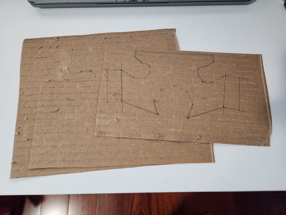
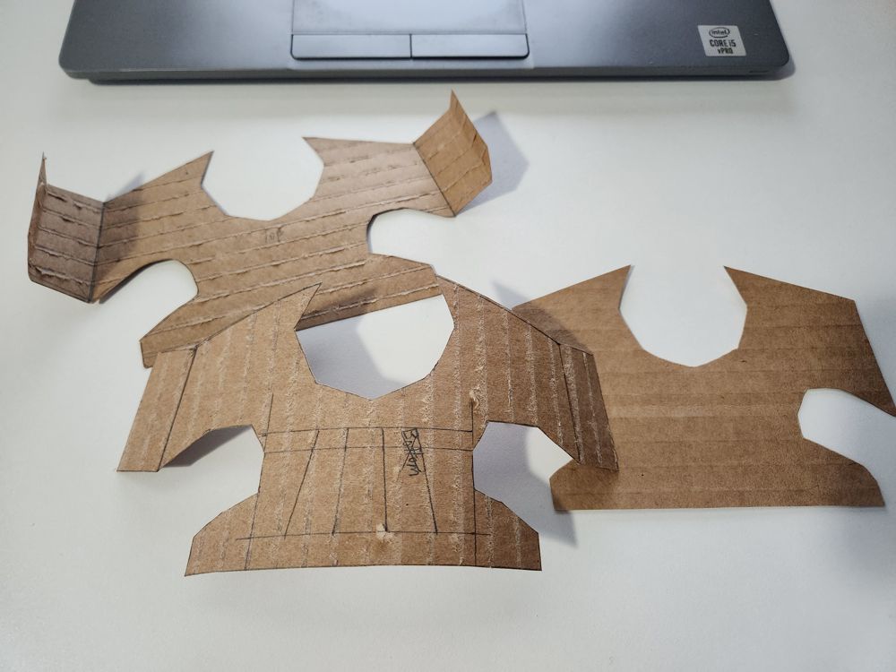
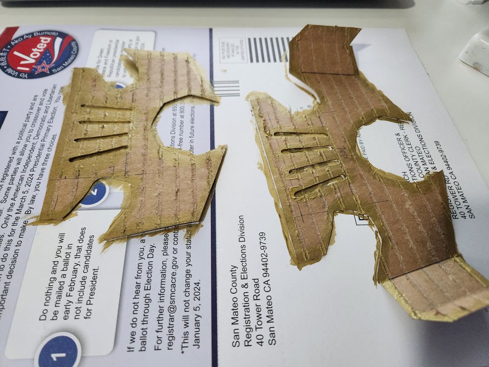
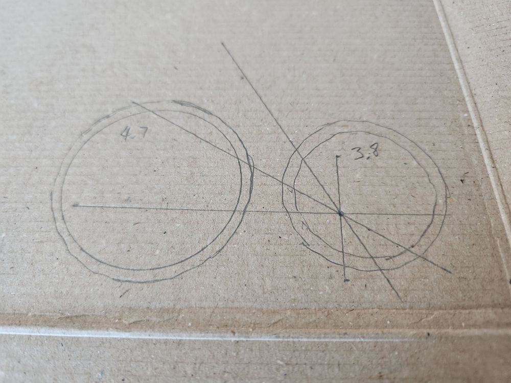
- The curves here were more complex than any of the prior projects, so measuring individual parts out with a ruler wasn’t gonna cut it. I used a grid approach to enlarge a digital image, and cut out a template to trace onto the project components
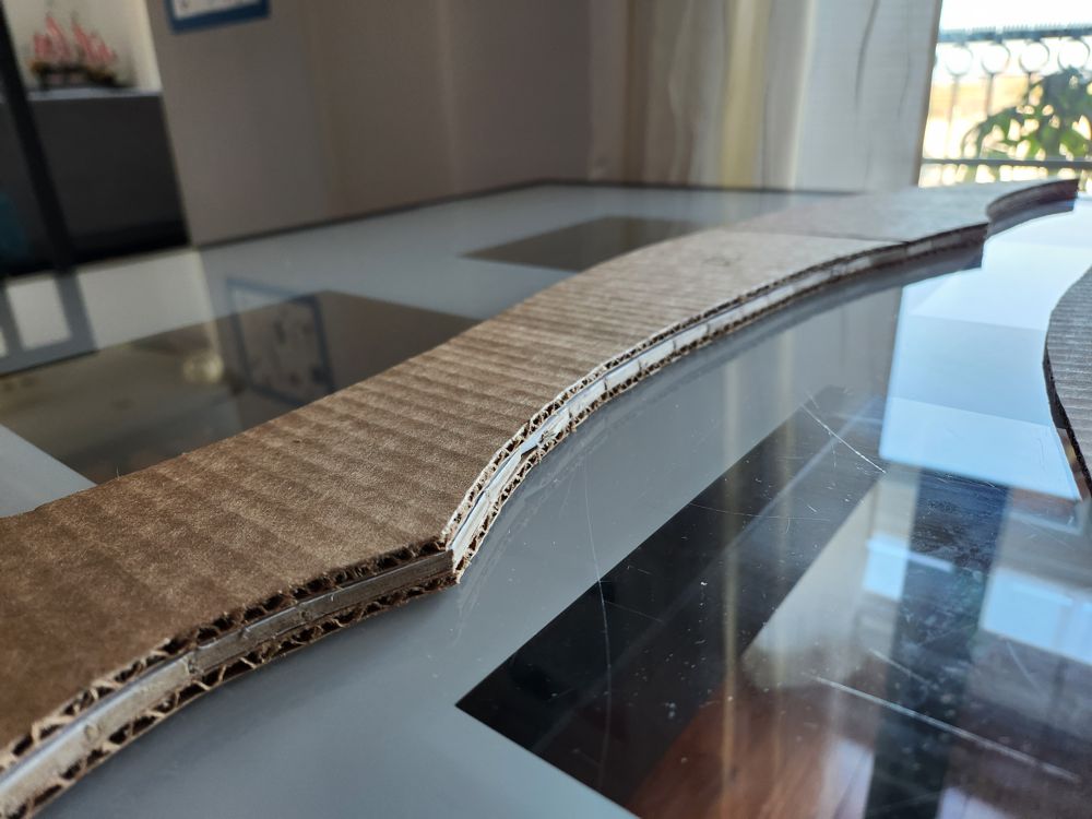
- The body of the saber was longer than any cardboard box I had seen, so it was necessary to stitch together multiple pieces for each layer of the construction. This was really time consuming to do. I made the connecting cardboard pieces in each layer different sizes so they could interlock for strength
- I never fully realized this before but corrugated cardboard came in more than one thickness and firmness. Because I needed several large sheets of this stuff, I had to go through a lot of shipping boxes to procure consistent materials
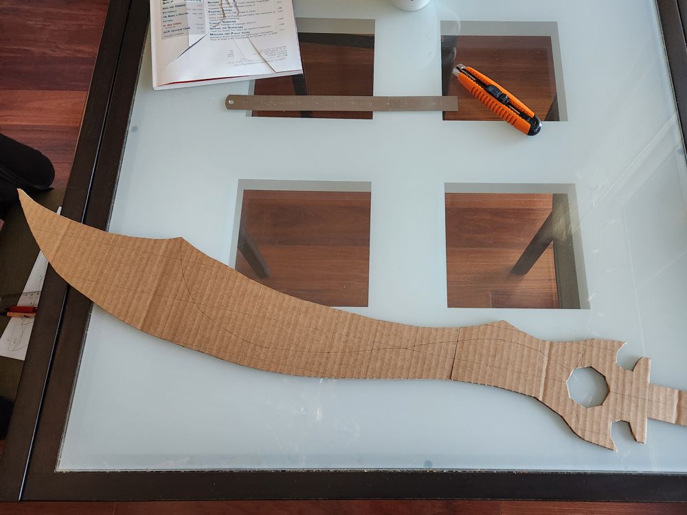
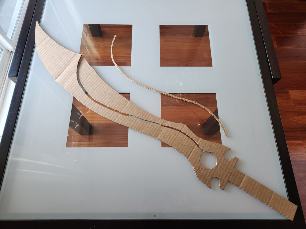
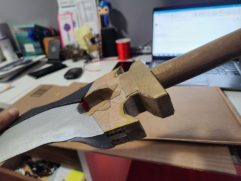
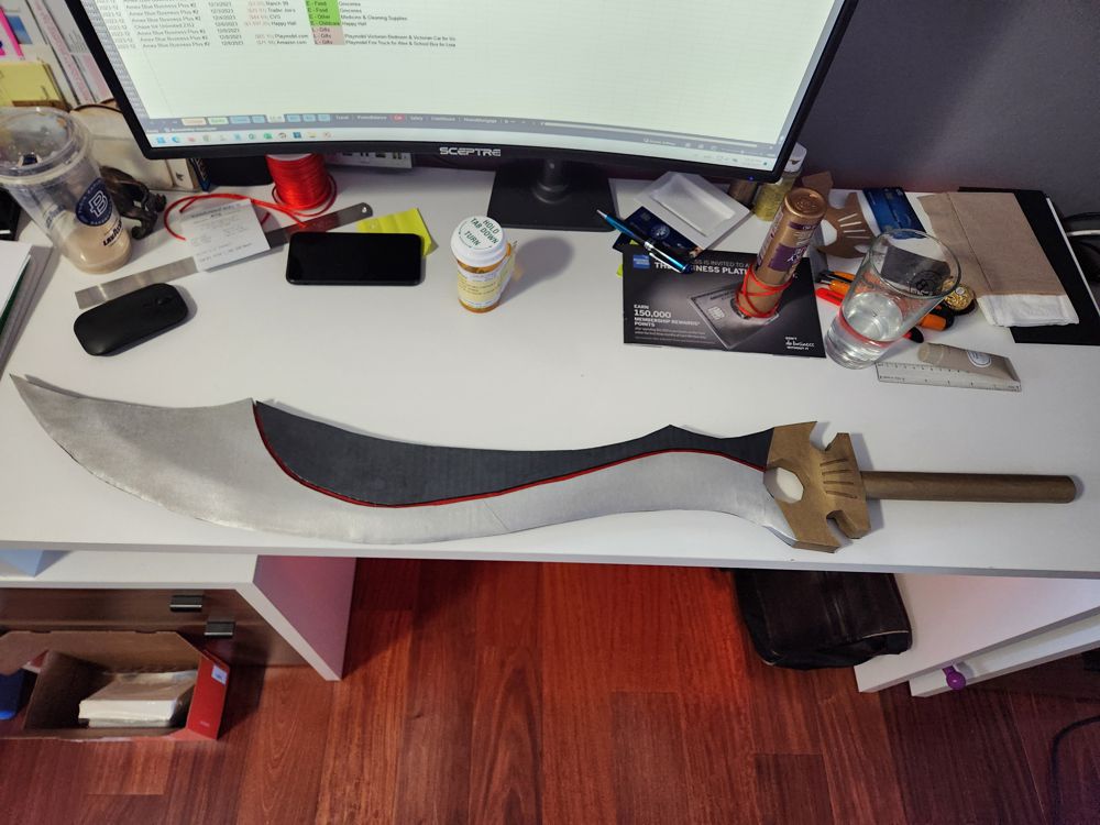
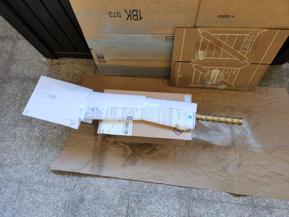
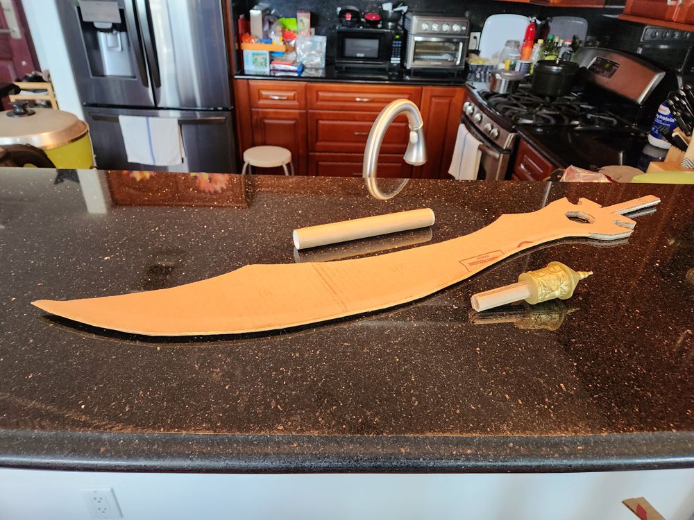
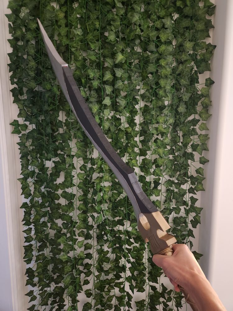
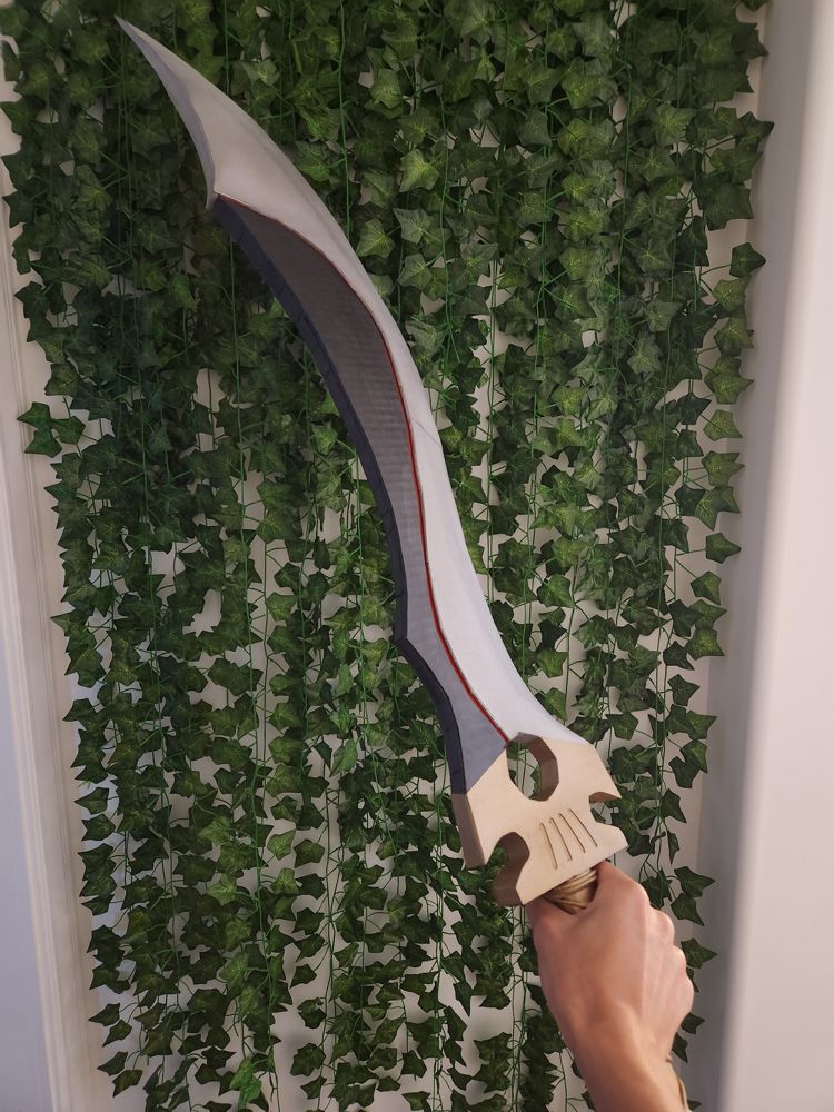
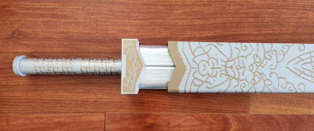
2. The Blade
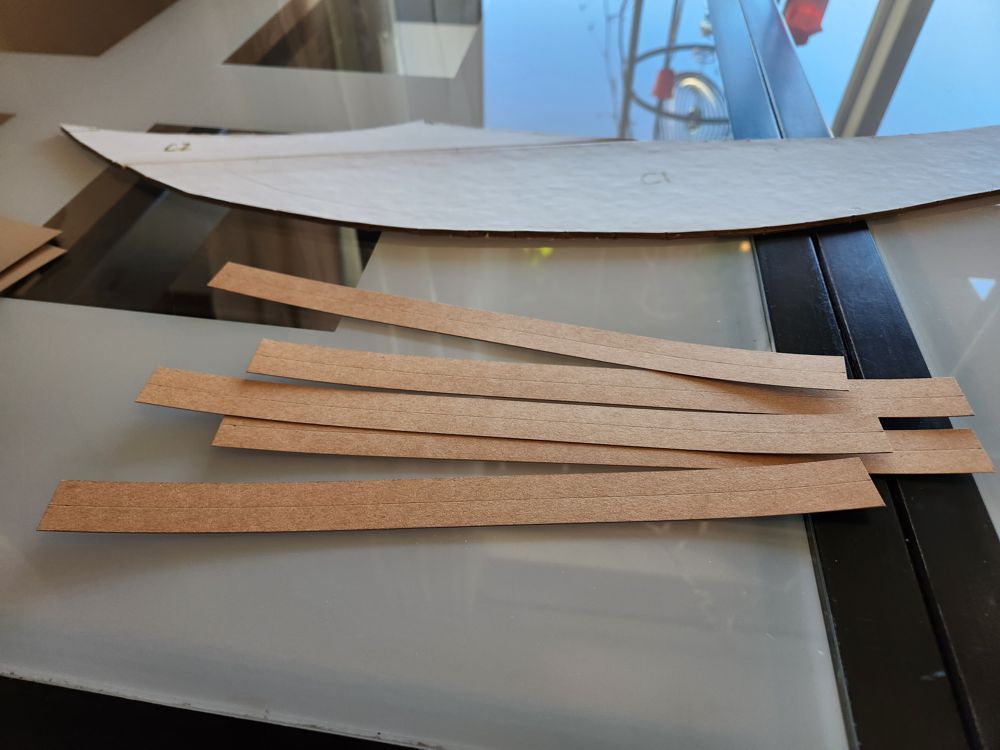
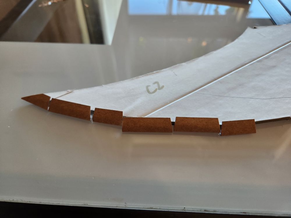
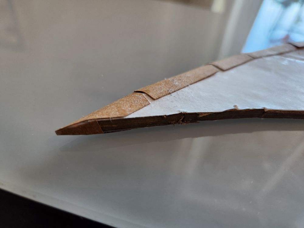
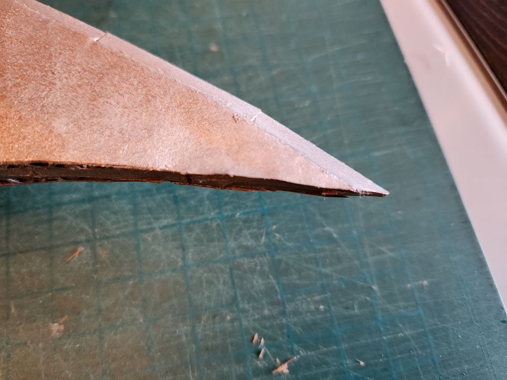
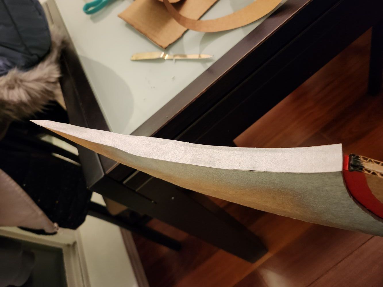
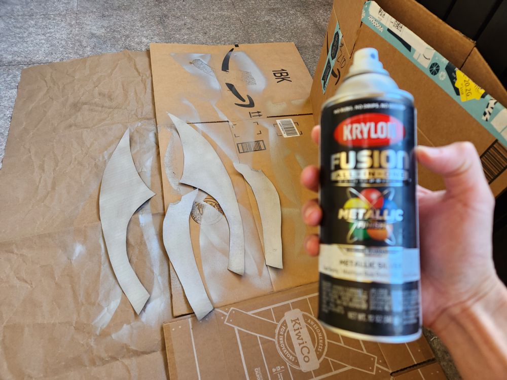
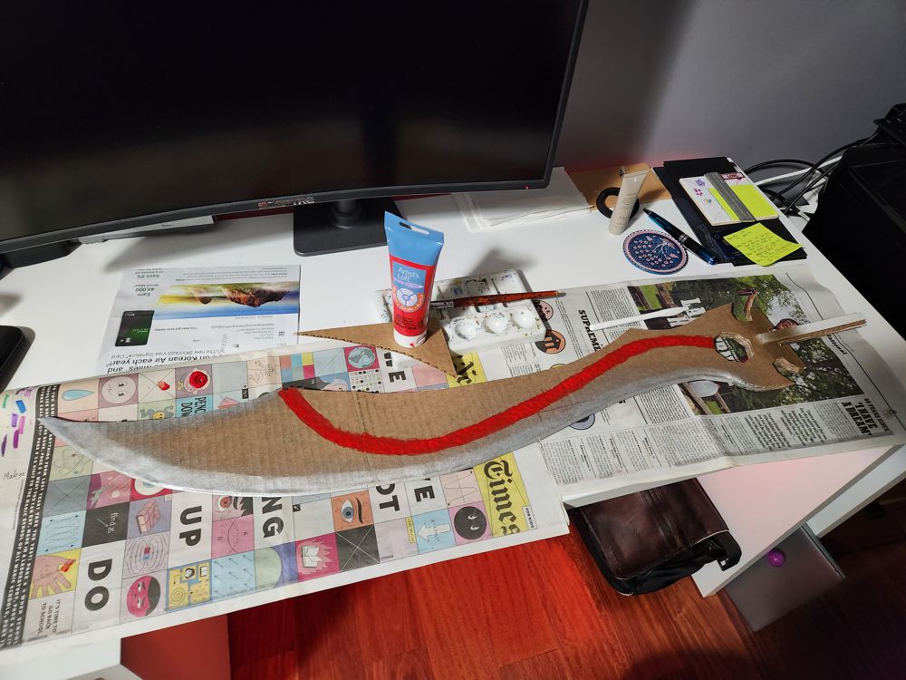
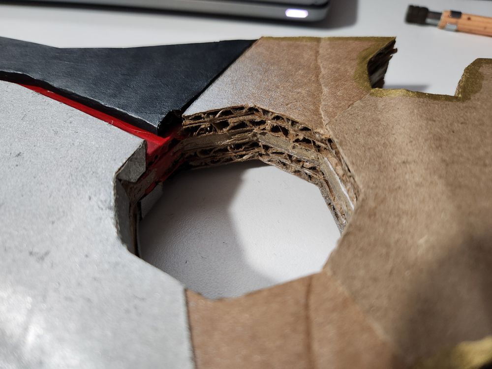
For the sharp edge, I glued folded card stock to the end of the middle cardboard. When I did it for the two blades on the spear head, 4 such edges were all I needed. For this blade, I had to use 28 to create an illusion of roundness. There went my Black Friday. Learning from my previous mistakes, I made better calculation for the pointy tip so it was properly shaped and strengthened. To make the blade 3D, the two outer layers of cardboard on each side were successively recessed 1-2cm. Finally, a flat sheet was applied on top, kind of like wrapping paper, to cover up the various components and create a more smooth look.
After two somewhat expensive projects, I wanted to go back to the roots of making stuff purely out of garbage. The plan was to not spend a single dime. Unfortunately, my silver spray paint ran out when I was just short of covering the last bit of the blade. In the end, I had to shell out $12 for a new can.
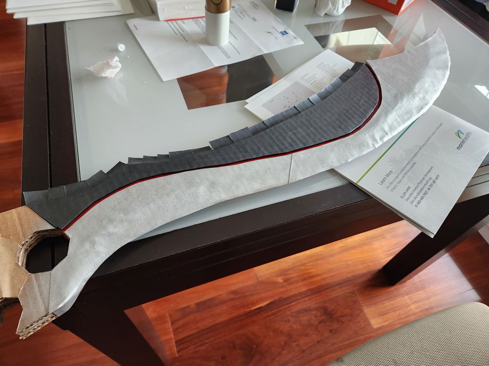
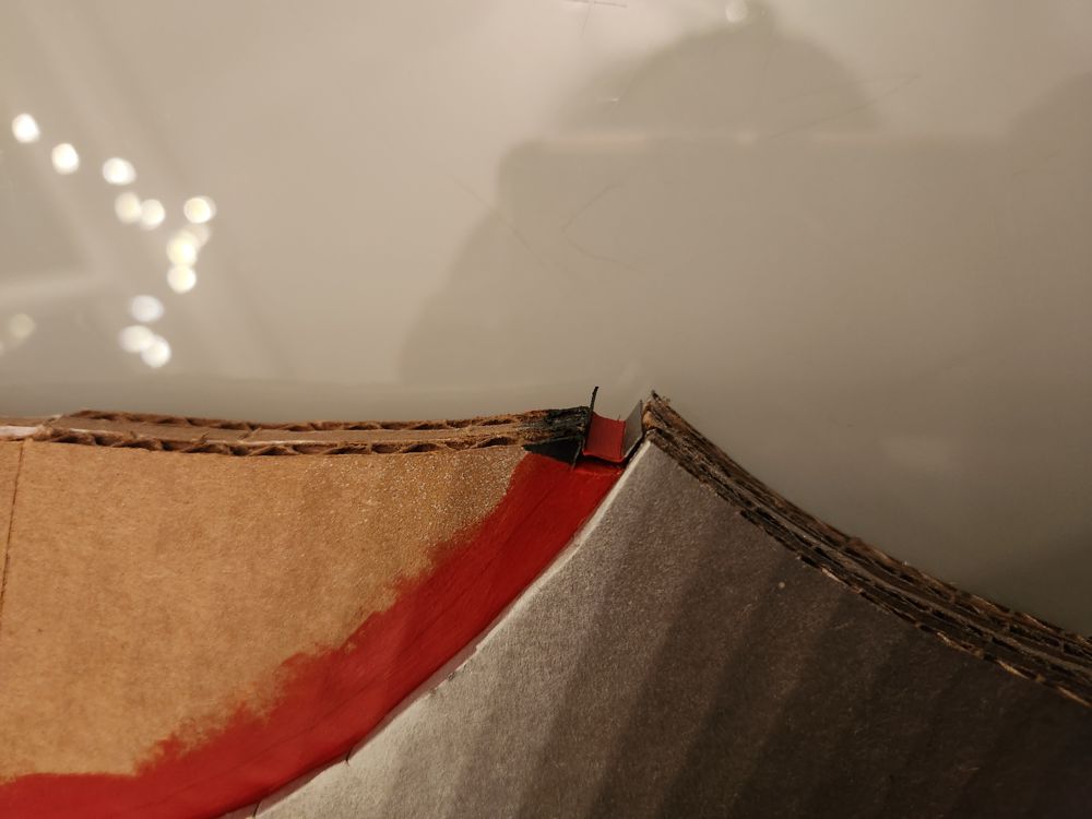
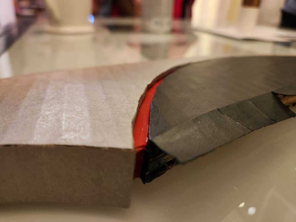
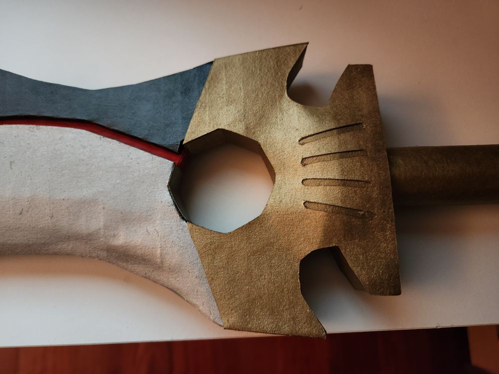
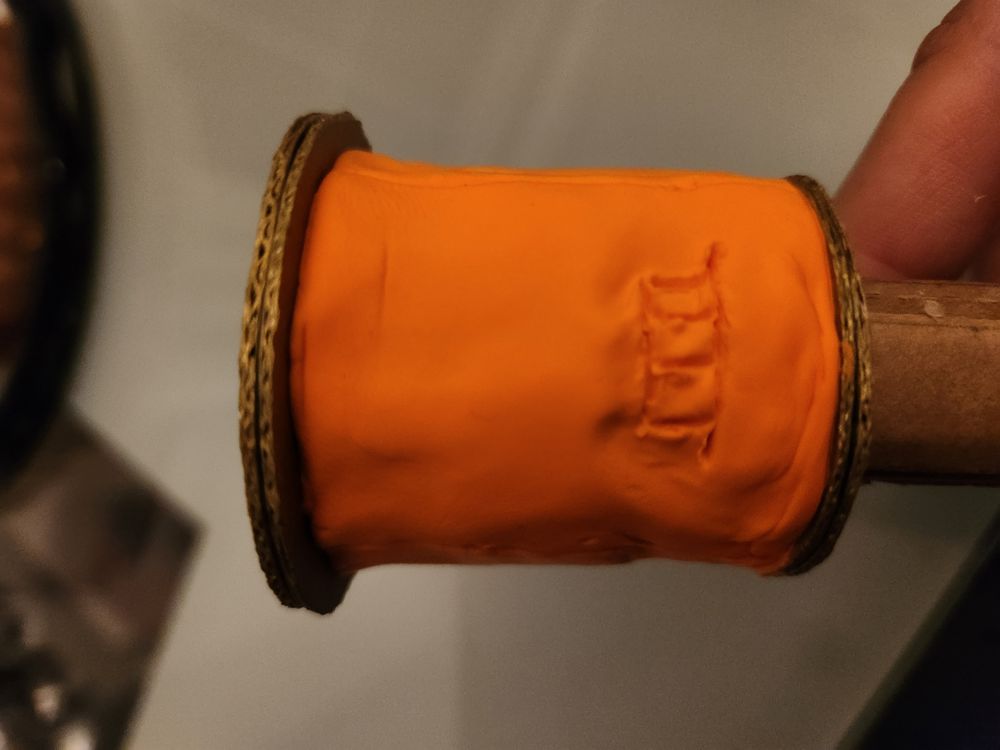
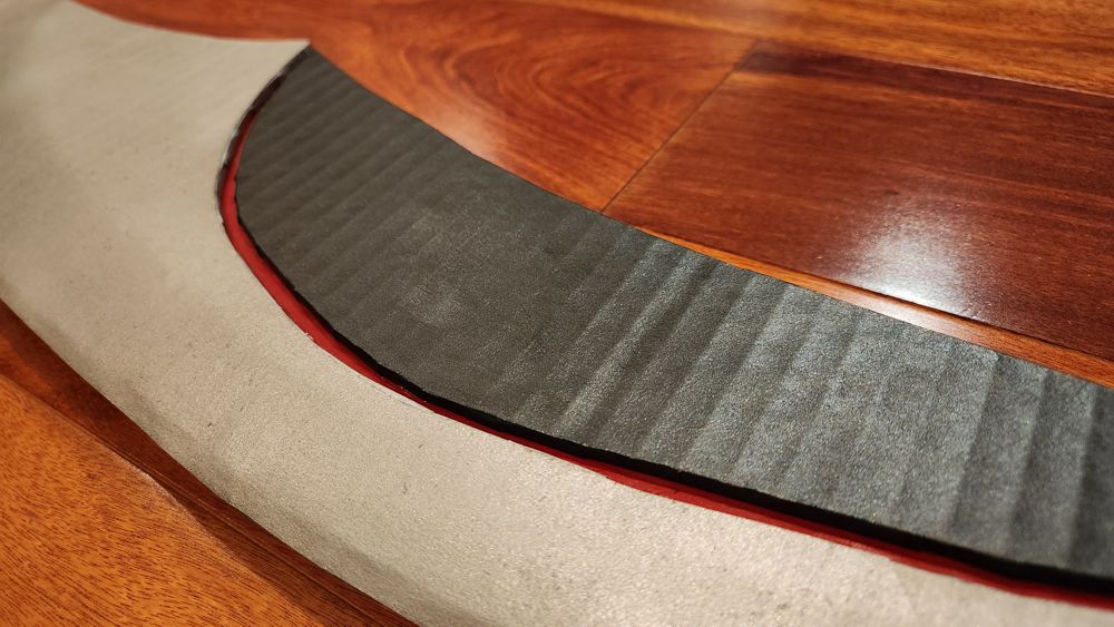
3. The Groove
One of Jing Ji’s most prominent features is the bright red groove (or fuller) between the black back and the silver blade. In the canon, this groove was colored red by its original owner’s blood running through it during that initiation process. The weapon acknowledged their bond and agreed to fight with him because the manly man was willing to sacrifice his life for it.
Most of the work here involved covering up and painting the sides of the corrugated cardboard before gluing them down. The groove was quite narrow and it’d be very hard to fix the colors once the final shape took place.
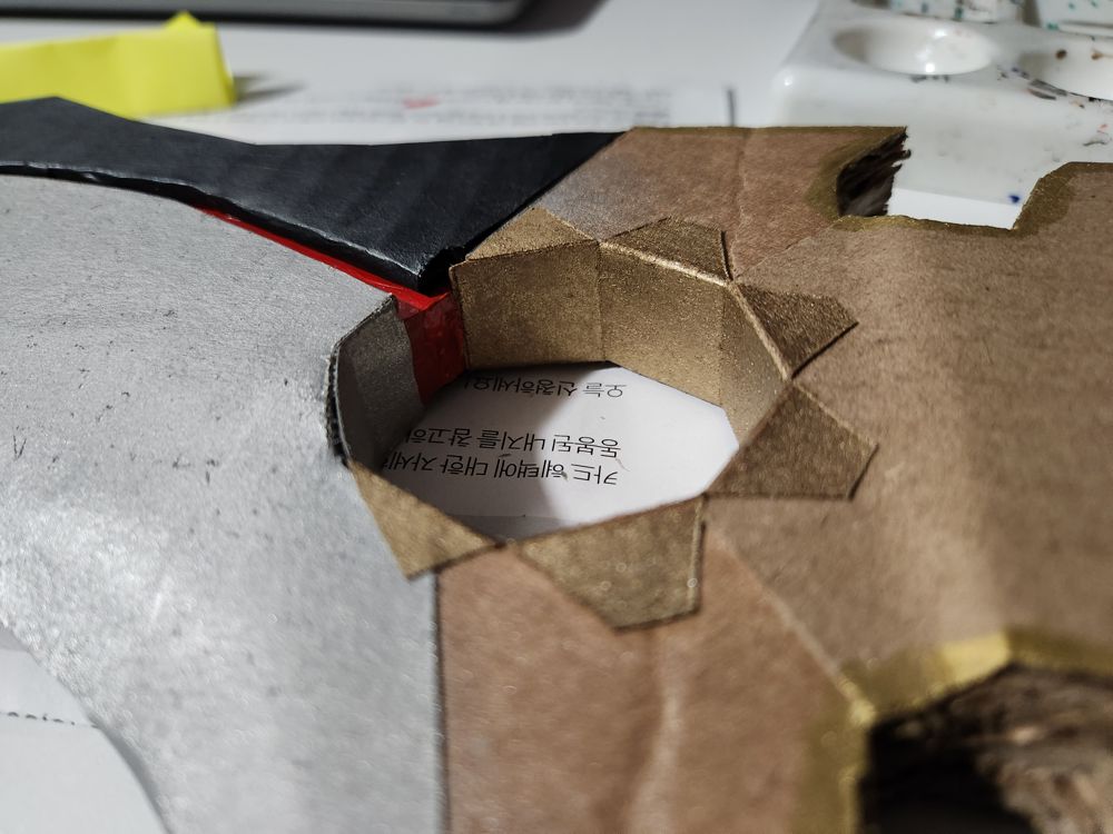
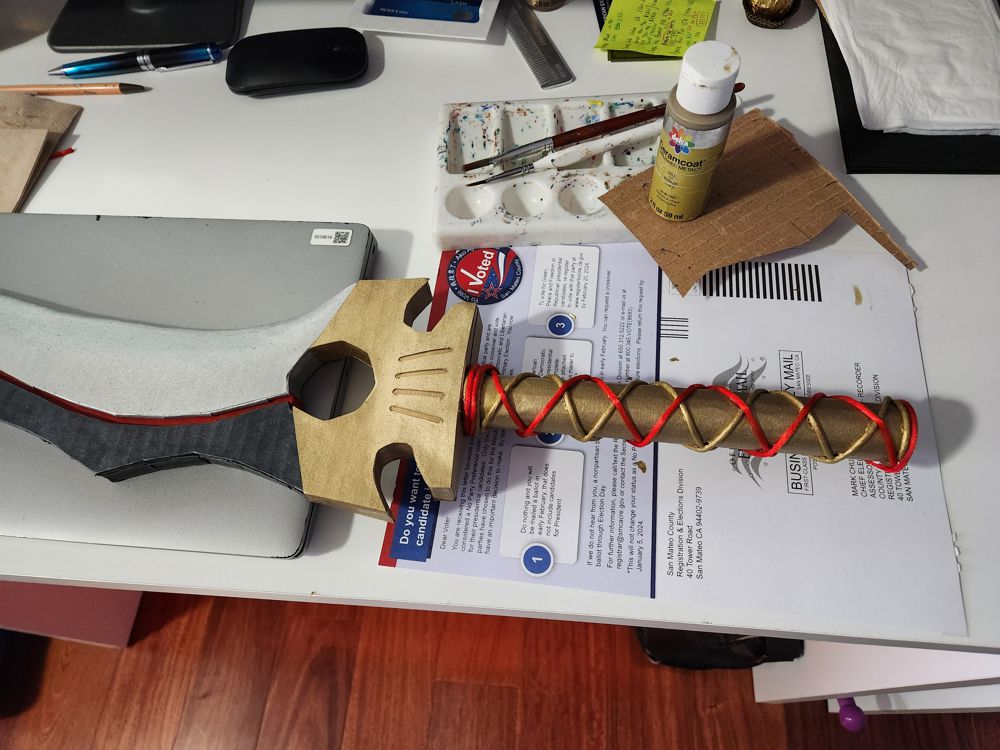
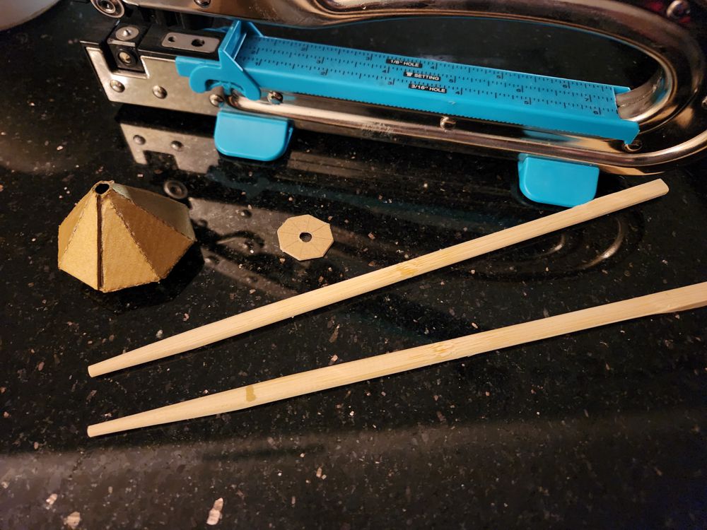
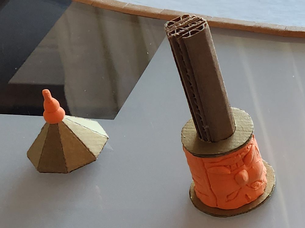
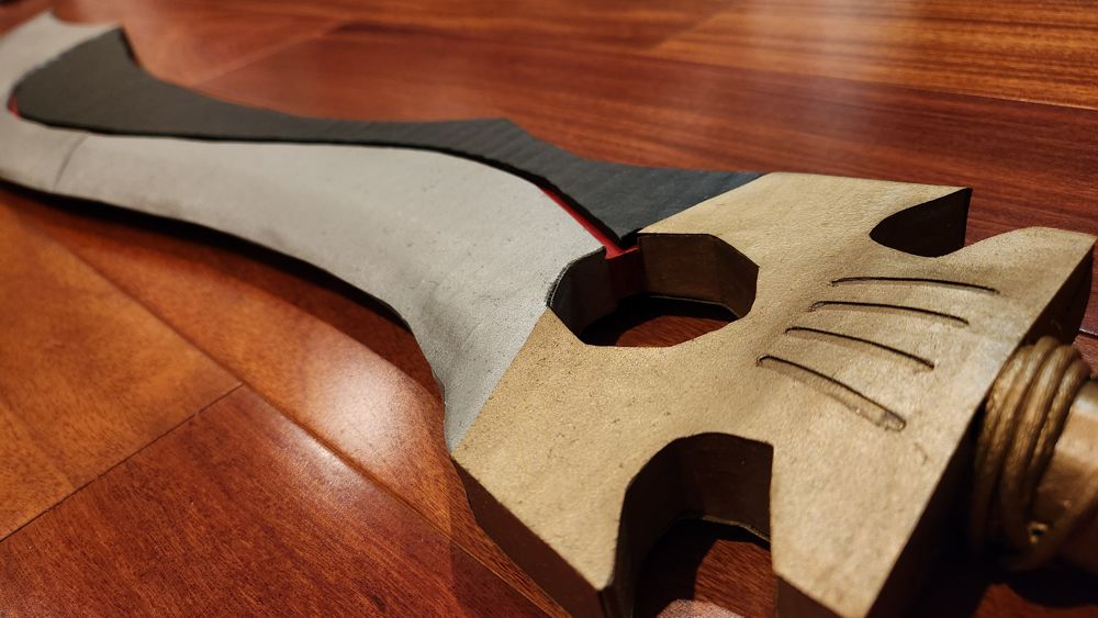
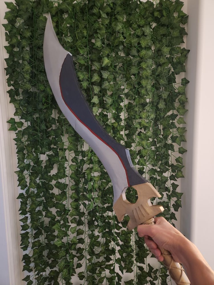
4. The Circle
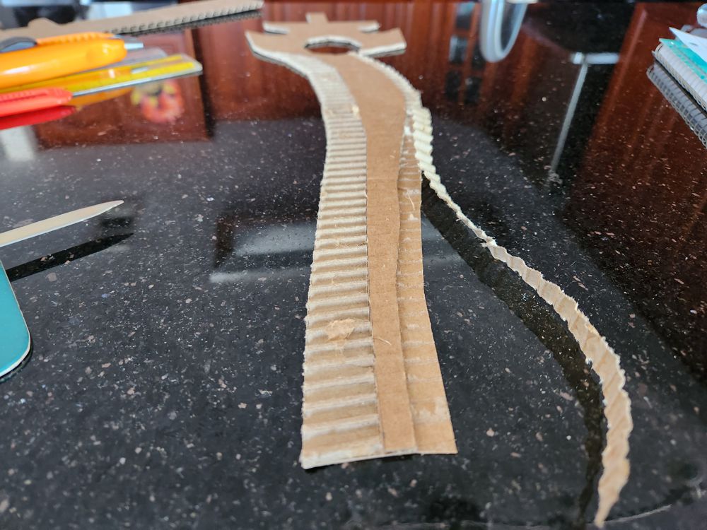
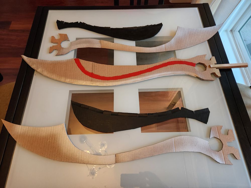
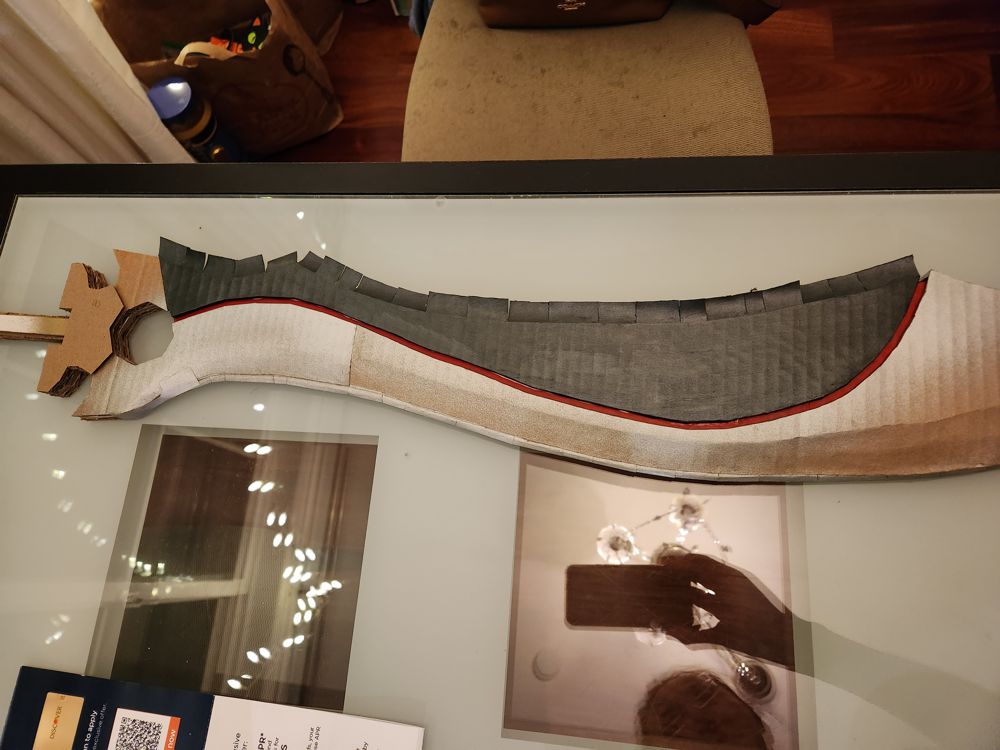
The big circular hole between the blade and the hilt is the most iconic part of Jing Ji. I have many questions about the physics of this design, but in the story it was a fantastic feature. The owner could look through the circle to find weaknesses in his opponent’s qi; put a finger through that hole and spin the blade “like a windmill” for a super attack; or use it to trap and break an enemy’s weapon…
I couldn’t do a circle, but cut out an octagon instead. After covering up the sides with properly measured and painted strips of paper, it looked pretty good.
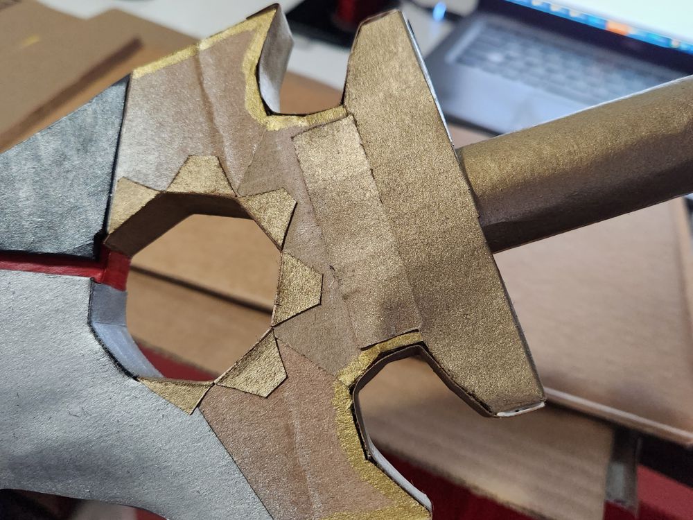
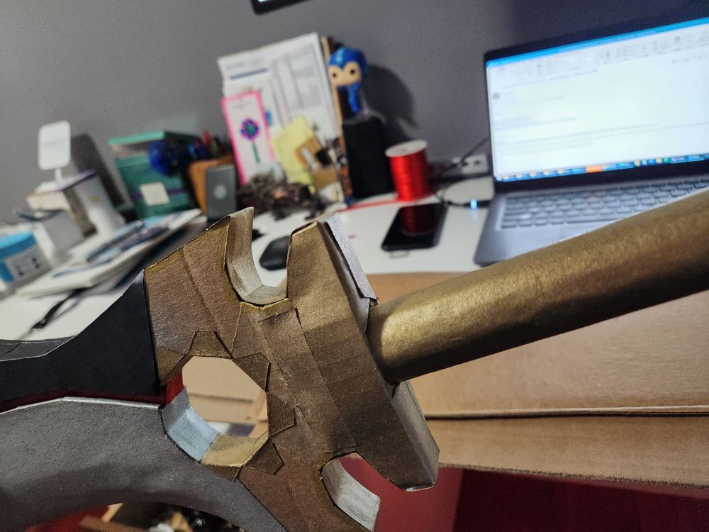
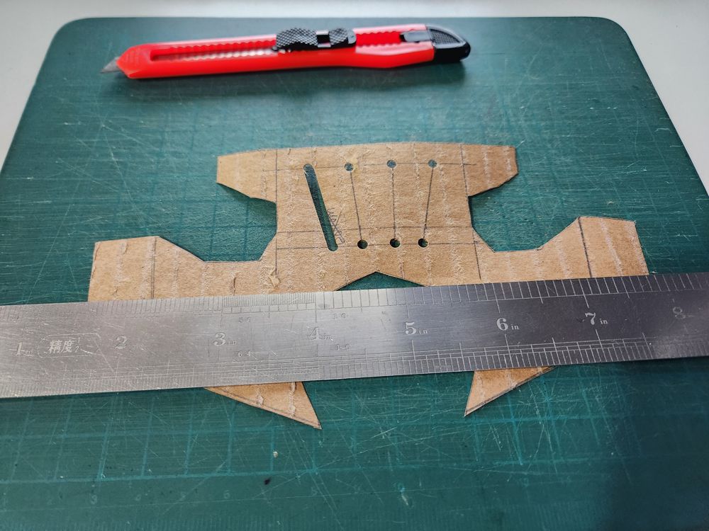
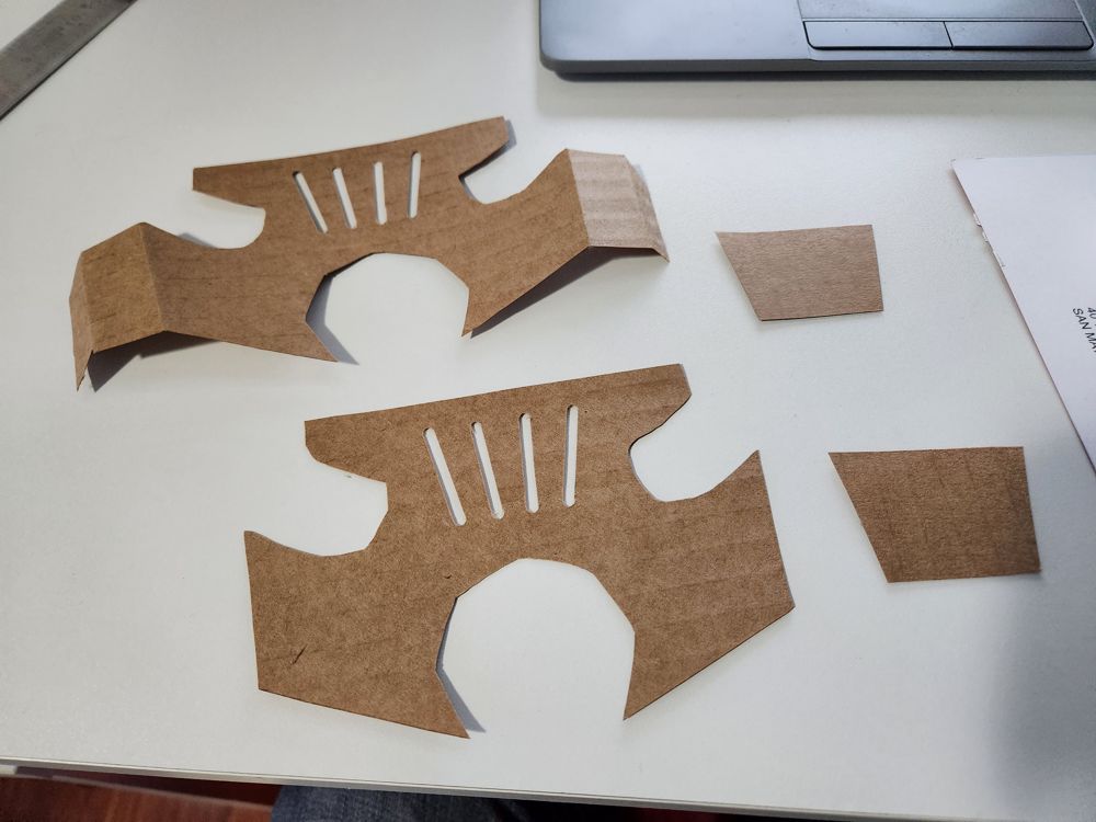
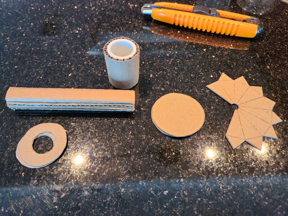
5. The Crossguard
A lot of weapons have a crossguard between the blade and the hilt to protect the user’s hand. But does Jing Ji, the saber for a manly man, really need such a thing? Its design has got a tiny piece narrower than the blade itself and probably isn’t very effective for anything.
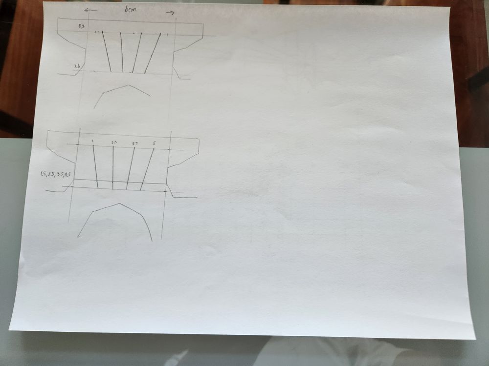
For this saber, this part is where the thicker hilt transitions to the narrow blade. The blade already consisted of 5 layers of thick cardboard (1 hard and 4 corrugated, 4mm each). Molding the crossguard into shape required 4 more layers of thin corrugated cardboard (2mm). The construction under the surface was messy, but the end product was smooth and round. I was very happy with it.
On the crossguard are four decorative shallow grooves that I consider to be the least important of all this saber’s features. I initially planned to just paint them, but had no idea how to paint straight lines with rounded ends. So I use a hole puncher to cut out these grooves instead, and layered another piece of paper with a darker paint underneath. The end result had a mildly 3D appearance and looked expensive.
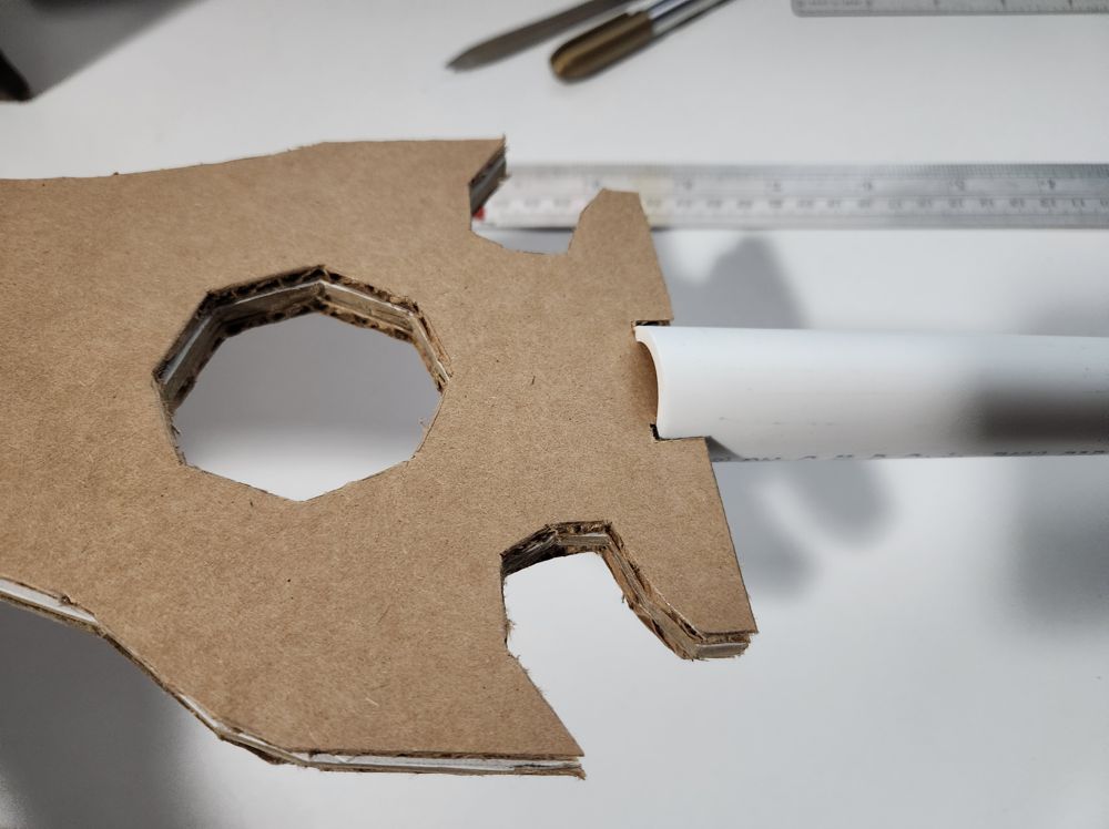
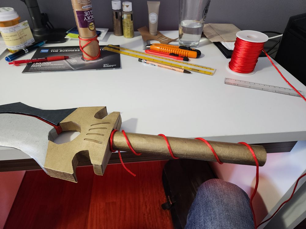
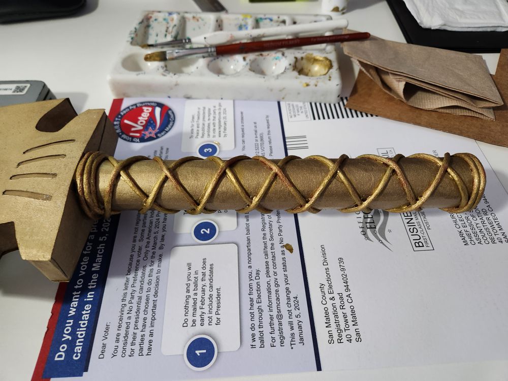
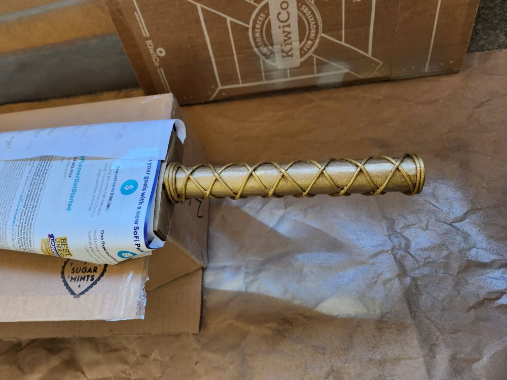
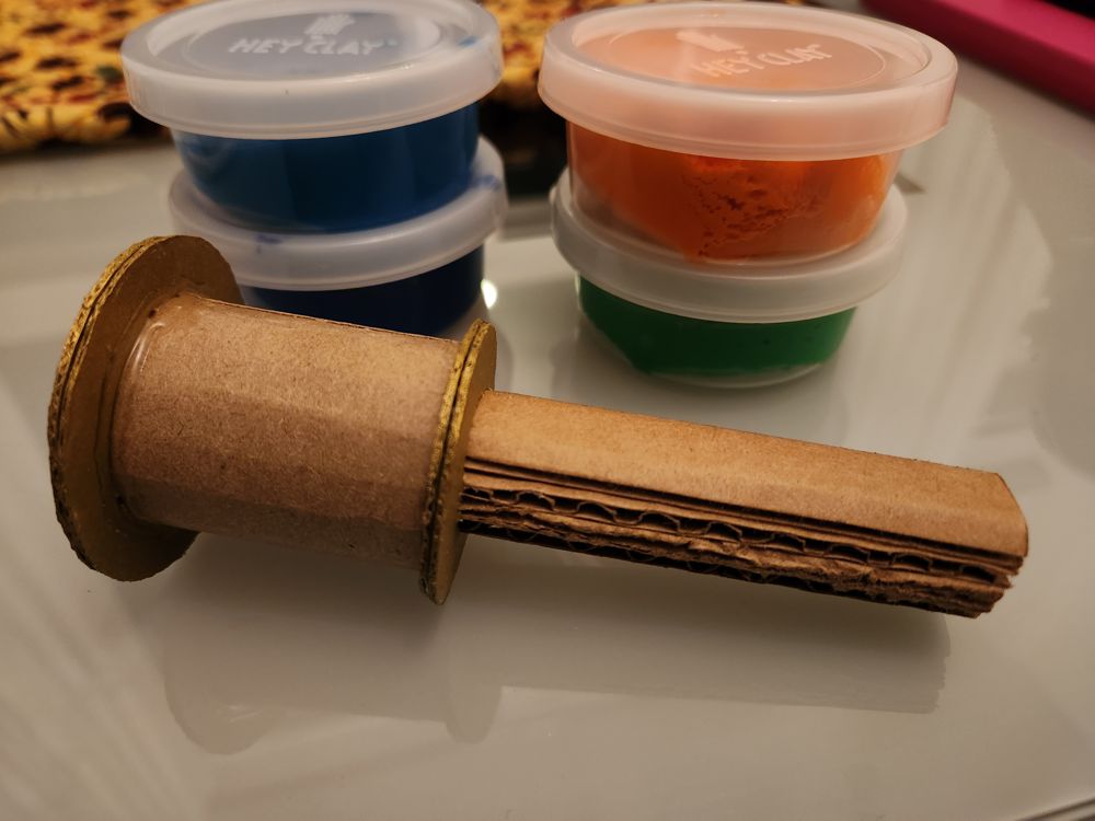
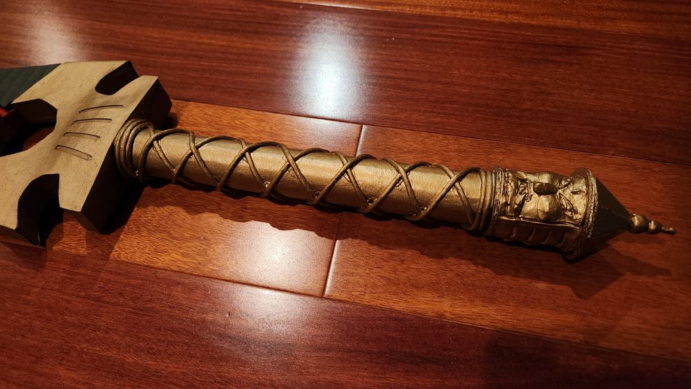
6. The Hilt
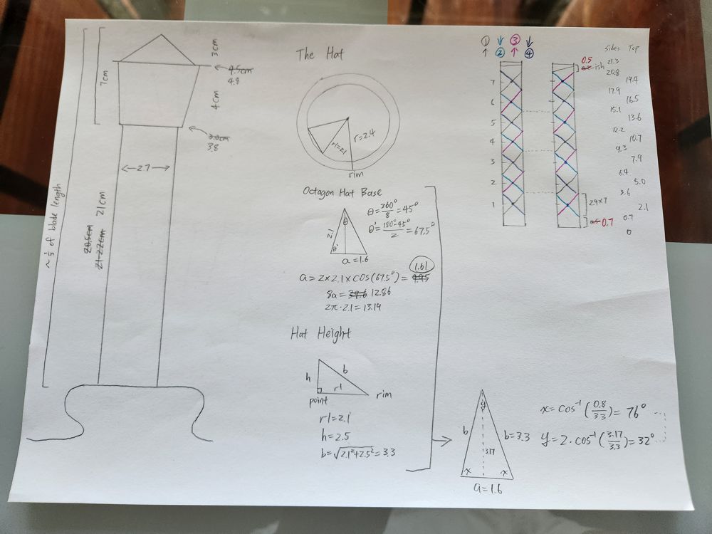
The saber is generally a single-handed weapon, but for certain concentrated moves it can be held in both hands. As such, the hilt needs to be long enough to fit both of my hands on it, but not any longer. With my trusted PVC cutter, I got a perfectly sized pipe. From there, the blade parts were manufactured to interlock with the pipe, so the combo was sturdy before applying glue.
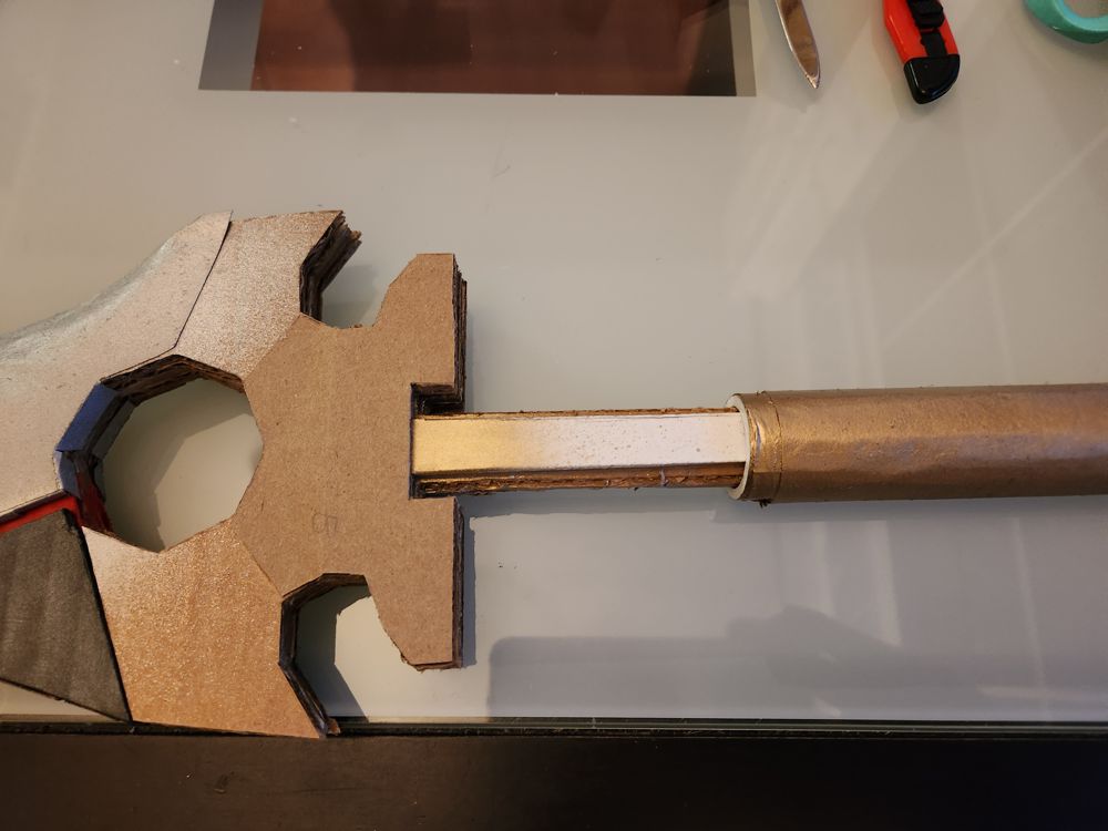
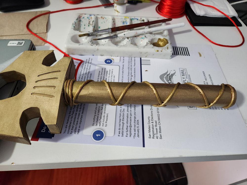
The hilt wrapping on Jing Ji is sparsely spaced using a thick, rough cord, which I interpret to be an intentional design. It looks uncomfortable to hold for all but the most calloused hands. Replicating the wrap design from drawings was an enjoyable part of the process, but painting the cord was rather tedious.
I spent a long time contemplating whether to leave the cord wrap in the satin red color. Red on gold is generally a nice color combination. A few frames in the graphic novel colored the hilt this way, and the official merch did, too. However, whereas the rich color combo looks great on the Hegemon’s Spear representing power and wealth, it seems out of place on this saber which is more like a lone wolf’s canine.
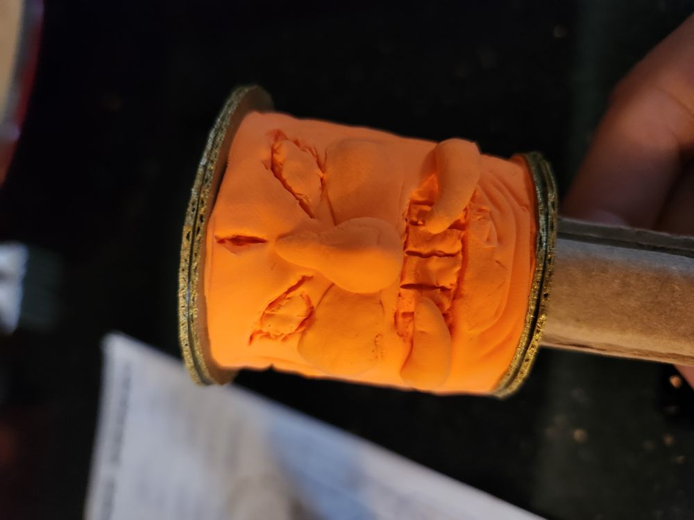
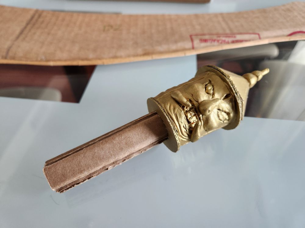
7. The Pommel
Finally, at the far end of Jing Ji’s hilt is a pommel with a demon’s face on each side.
This intricate sculpture is both instantaneously recognizable and difficult to pay attention to. It made sense that some replica attempts chose to replace it with more generic patterns, though such corner cutting is easy to spot and degrades the overall look and feel. I decided to keep my project as faithful to the original design as possible.
To make it happen, I borrowed some air-dry clay from the kids. Sculptures were way out of my comfort zone, but I gave it a shot and had fun in the process.
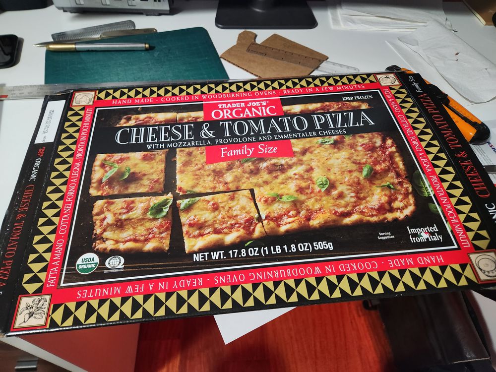
8. Jing Ji
After a whole month in the cardboard forge, this legendary saber was complete.
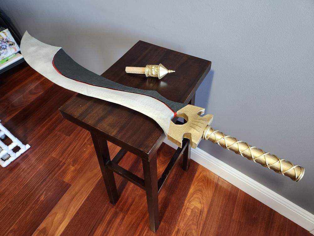
My 4th weapon of the year took the most effort and resulted in the highest level of attention to detail. I was very happy with it.
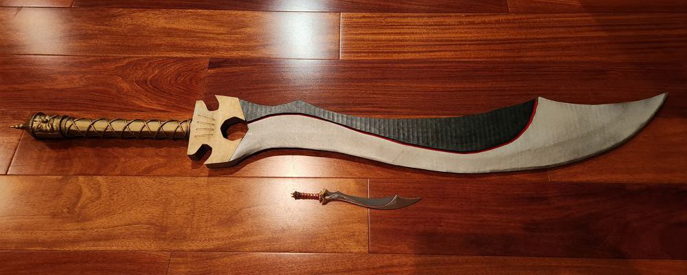
Here’s my life-sized 驚寂 Jing Ji replica next to the official merch that I’ve treasured for 20 years.
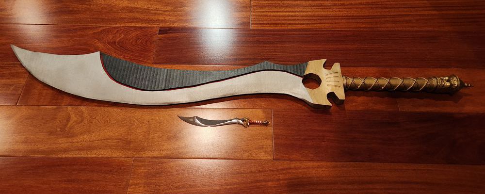
Of all my projects this year, this one was most adequately sized and balanced, and therefore the easiest to carry around and play with.
Wind Cloud used to enjoy so much popularity that its publisher was able to pump out endless products. At its peak, they even sold life-sized replicas of the two main characters’ sword and saber. Seeing the limited-edition listing at the online store back then was like seeing a Lamborghini in the street now… the infinite desire was confronted with the realization that it was infinitely impossible for me to afford.
Twenty years later, I’m holding a life-sized Jing Ji and remembering all those dreams from the younger days. Having forged it with my own hands rather than purchasing from a souvenir factory allowed me to connect with it more intimately, too, much like that manly man and his badass saber in the original story.
While researching for this project, I came across a blog post of someone around my age describing his journey through the fandom. He too itched over the unaffordable official merch as a high school student. Then, once he “made it”, he commissioned a carpenter to carve a Jing Ji replica out of wood. I was envious seeing it a month ago, but no longer feel that way now that I have made my own.
The Forge of 2023:
No Comments